A website looks bad on mobile when it was designed on a desktop and never tested on a phone — text scaled down instead of reflowed, buttons too small to hit, and a menu that needs two hands. Most of your visitors are on a phone. If the site only works on the screen you built it on, it only works for you.
The before
Here’s a site I see about ten times a week, and the tell is always the same: it looks great on the owner’s laptop.
Wide hero image with the business name centered over it. A row of four service boxes. A nice map. The owner built it at a desk, looked at it at a desk, showed it to his wife at a desk, and everybody agreed it looked sharp.
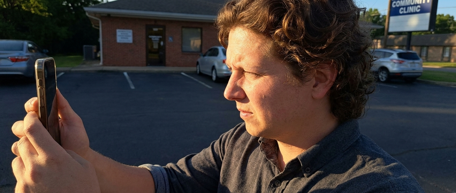
Now watch what the customer sees. She’s in a parking lot with one hand on a stroller. She taps your link. The whole desktop page loads shrunk to fit a 6-inch screen, so the headline is legible only if you squint, and the body text is about four points tall. She pinches. Now she’s zoomed into the middle of a service box and has lost the navigation entirely. She swipes sideways to find it — the page scrolls horizontally, because something on it is wider than the screen, and now she’s looking at the empty margin beside your content.
She wants one thing: the phone number. It’s in the footer, thirty seconds of scrolling away, and when she finally hits it, it isn’t a link — it’s text, so tapping it does nothing.
She backs out and taps the next result.
“You are the only person who will ever see your website on the screen you built it on.”— Vincent Jordan
The cost is invisible, which is what makes this one so durable. Nobody calls to tell you the site was hard to use on a phone. They just don’t call. You look at your laptop, see something that looks fine, and conclude the website “doesn’t really bring in much” — when what actually happened is that most of the people who wanted you never got past the parking lot.
And there’s a second bill. Google has crawled and ranked with the phone version of pages as the default for years now. A site that’s painful on mobile isn’t just losing the person holding the phone; it’s being judged on the version you never look at.
Do the test right now, honestly: open your own site on your own phone, in the car, one-handed, and try to call yourself. That’s the whole audit.
The after
The fix isn’t a separate mobile site — that idea died a decade ago. It’s a page that reflows: one column on a narrow screen, text that stays readable without zooming, a tap-to-call number near the top, and buttons big enough for a thumb.
Designer Talk is an AI page builder that lets you build WordPress pages by describing them in plain English — no drag-and-drop, no design skills. Sections come out responsive by default, and the builder’s preview lets you switch to real device widths, so you can see the phone version while you’re building instead of discovering it later. Get started with Designer Talk today and fix the top of the page tonight. Set your colors and font once in Brand Settings, then talk to the section. Here’s the flow, for a fictional chiropractor in Tacoma:
create a hero section for Hillcrest Family Chiropractic in Tacoma — headline Same Day Appointments for Back and Neck Pain, a line that we take most insurance and new patients are seen within 24 hours, and a big tap to call button with our number (253) 555-0118 that stacks into one column and stays easy to read on a phone.
Notice what that prompt asks for: a phone number that is a button, not a line of text, and a single column on a narrow screen. Those two things fix most of what went wrong in the parking lot. Now the photo — photos never go in the section prompt. Hit the + button in the section chat, choose Generate Image, and describe the shot:
A clean bright chiropractic treatment room with a single adjustment table and a window, calm and uncluttered, no people.
It saves straight to your Media Library. Click Insert, tell the section “use this as the hero background,” then switch the preview to the mobile width and keep talking until it works in one hand:
Make the call button full width on mobile.
Increase the body text size on small screens.
Move the insurance line above the button.
Swap in a photo of your own office when you have one. Then go back through the rest of the page the same way, checking each section at phone width as you build it rather than at the end.
None of this is a design problem. It’s a point-of-view problem — you have been looking at your business from the one seat no customer ever sits in.
Common questions
Why does my website look bad on mobile?
Almost always because it was designed at desktop width and never rebuilt to reflow. Instead of rearranging into a single readable column, the desktop layout gets scaled down, so text becomes tiny, tap targets end up too small, and something wider than the screen causes sideways scrolling. Fixed pixel widths, large uncompressed images, and multi-column rows that never collapse are the usual culprits.
How do I know if my website is mobile friendly?
Open it on your own phone and try to complete the one action you want visitors to take — call, book, or order — using one hand, without zooming. If you have to pinch to read anything, if the page slides sideways, or if the phone number isn’t tappable, it isn’t mobile friendly. That test is more useful than any score, because it measures the thing that actually costs you money.
Do I need a separate mobile version of my site?
No. Separate mobile sites were a workaround from the early 2010s and created two sites to keep in sync. The modern approach is one responsive page that rearranges itself by screen width — same content, same URL, different layout.
Describe a hero that stacks into one column with a tap-to-call button — and check it at phone width before you publish.
Get Started Today